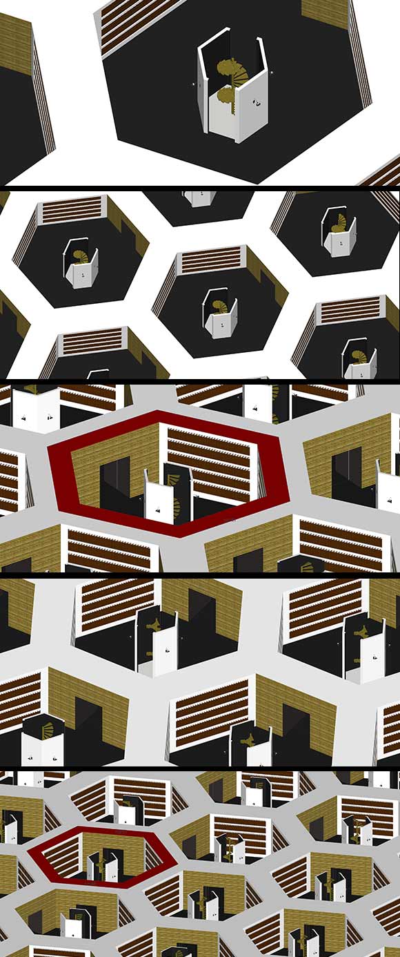
Babel
- vector drawing (route map)
- 3D model (views of the rooms/cells)
Babel is an attempt to make graphically visible the Babel Library, as described in tJorge Luis Borgès' eponymous short story. The description of the tentacular architecture is pretty precise and thorough, but it happens to be a mindblow when trying to represent it physically, in a coherent manner.
Extract : "The universe (which others call the Library) is composed of an indefinite and perhaps infinite number of hexagonal galleries, with vast air shafts between, surrounded by very low railings. From any of the hexagons one can see, interminably, the upper and lower floors. The distribution of the galleries is invariable. Twenty shelves, five long shelves per side, cover all the sides except two; their height, which is the distance from floor to ceiling, scarcely exceeds that of a normal bookcase. One of the free sides leads to a narrow hallway which opens onto another gallery, identical to the first and to all the rest. To the left and right of the hallway there are two very small closets. In the first, one may sleep standing up; in the other, satisfy one's fecal necessities. Also through here passes a spiral stairway, which sinks abysmally and soars upwards to remote distances. In the hallway there is a mirror which faithfully duplicates all appearances. Men usually infer from this mirror that the Library is not infinite (if it were, why this illusory duplication?)"
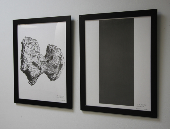
The shape of things to come
Graphit on paper
2 drawings, graphit on paper A3
- Tycho Magnetic Anomaly II
- 67P/Tchourioumov-Guérassimenko
From fiction to fictionalized reality.
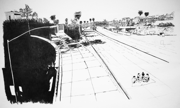
Sur les pavés la plage
Graphit on paper
3 sheets, total dimensions: 100x300cm
An utopy about L.A. freeways emptied from the uncessant flow of cars, reconquered by humans.
Rubble
Video Animation
full length: 3'24"
Factories, building collapses, rubble, mutations...
Watch full-length video preview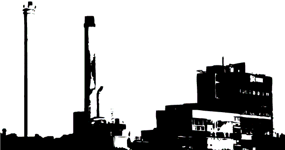
An attempt to saturate measurable space
10 drawings series (details)
Ink on paper, variable dimensions
Series of drawings, ink on paper, various sizes: saturating the space by measuring it, measuring within the measure, within the measure in the measure [...]
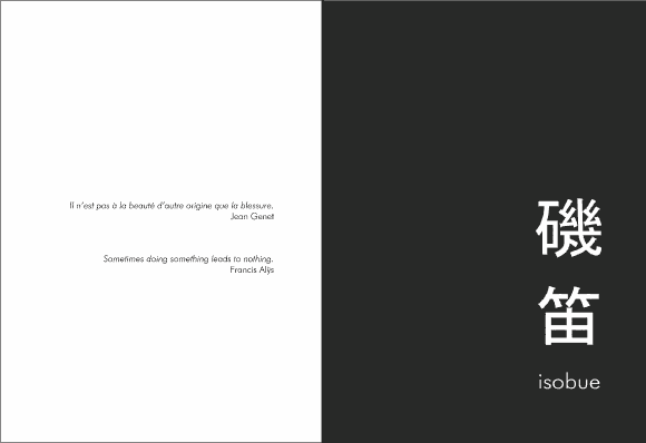
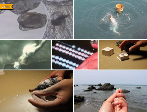
Isobue
- India ink on paper (A5)
> Self-produced edition silkprint - 32 pages
20 copies numbered (in progress)
The project is composed of two elements, a graphic novel and a video, both based on the same scenario:
The research is located in Japan, in the bay of Ise, and follows the story of a pearl.
It goes from the birth of a pearl, a fortuitous encounter between a grain of sand and an oyster (which, to protect itself from the alien element, will wrap it with nacre), then to the traditional harvesting by the “Ama san” (apnea women divers), the selection of the most valuable pearls, and the commercialization. I traced back the steps of the object, until I actually bought a pearl.
And destroyed it…
By patiently removing the layers of nacre, I searched for the initial point, the very cause of the existence of the pearl, the irritating element that led the oyster to defend itself and to constitute the pearl: the grain of sand.
"Beauty has no other origin than the wound" - Jean Genet
Once the grain of sand freed from its luxurious wrap, I went to put it back to the beach, to where it once belonged, in a gesture discharging me from possession. A long research and deconstructing process to eventually have nothing left in hands but having moved concepts, from the object to the poetic abstraction.
“Sometimes doing something leads to nothing” - Francis Alÿs
Note: The title Isobue refers to that peculiar sound made by the “Ama san” when they come back to the surface to breathe between long and repeated apneas.
watch the video
Order a copy
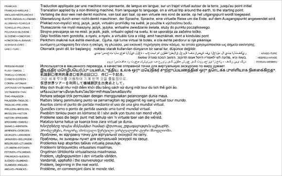
Problème, en commençant dans le monde réel (Problem, beginning in the real world)
Printing on paper - Variable dimensions
The first step is a french sentence that means in substance: «Translation applied by a non-thinking machine,
from language to language, following a virtual route around the globe, up to the initial point».
I had this sentence translated by GoogleTranslation, from the original sentence in french, to the english,
then from this already approximative result in english to german and so on and so forth, back to the french.
The final result has nothing to do with the original, and has been totally changed in its meaning, although
the sentence then obtained is the title of the work, and reveals an interesting aspect.
The title could be translated as: «Problem, beginning in the real world»
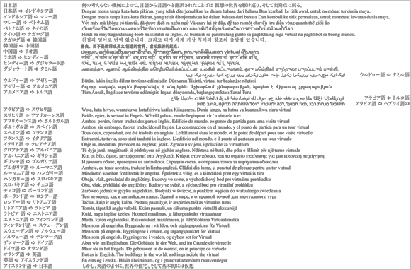
しかし、英語のように。世界の住宅、そして基本的には仮想
Print on paper - Frame - 50x70cm
As an introduction to the residency at AIR-Yamanashi, this work has been re-adapted, still with the same principle, but from japanese to japanese; the first sentence has been translated by a real person, and not a virtual program. As in the french vesion, the last sentence becomes the title of the work. And still, the loss of meaning by the end of the process is quite stunning...
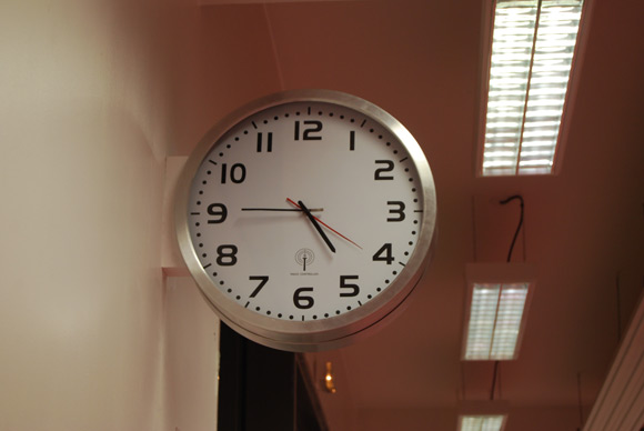
Méta-temps (meta-time)
2 modified clocks (2 sides)
Meta-time is a modified clock in such a way that the paces of the needles are inverted.
It gives the right
time but according to biased conventions: the hour needle give the minutes, the minute-needle gives the
seconds, and the second-needle gives the hours...
This work is about suspended time, a brief dissorientation, as an attempt to catch this moment when you
re-adjust your lecture via different conventions.
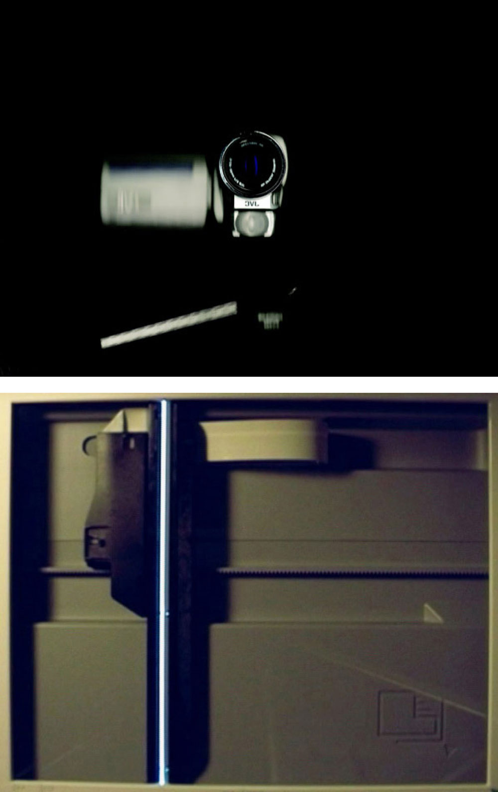
JVC/HP
Digital print photography / Video projection - Variable dimensions
JVC/HP is composed of a photography (digital) and a video facing each other. Each element is the visual
medium of the process of the making of the other: The video shows the beam of the scanner going
from one side to the other, and making at the same time a picture of the video camera that shoots the
film at the same time.
Both elements are produced at the very same time, and do not exist without the other. They are shown at
the same scale, face to face.
The title is evocative of Bertrand Lavier’s superpositions (ie: Braun/FichetBauche), as the production of
this piece is the result of a superposition of technical material.
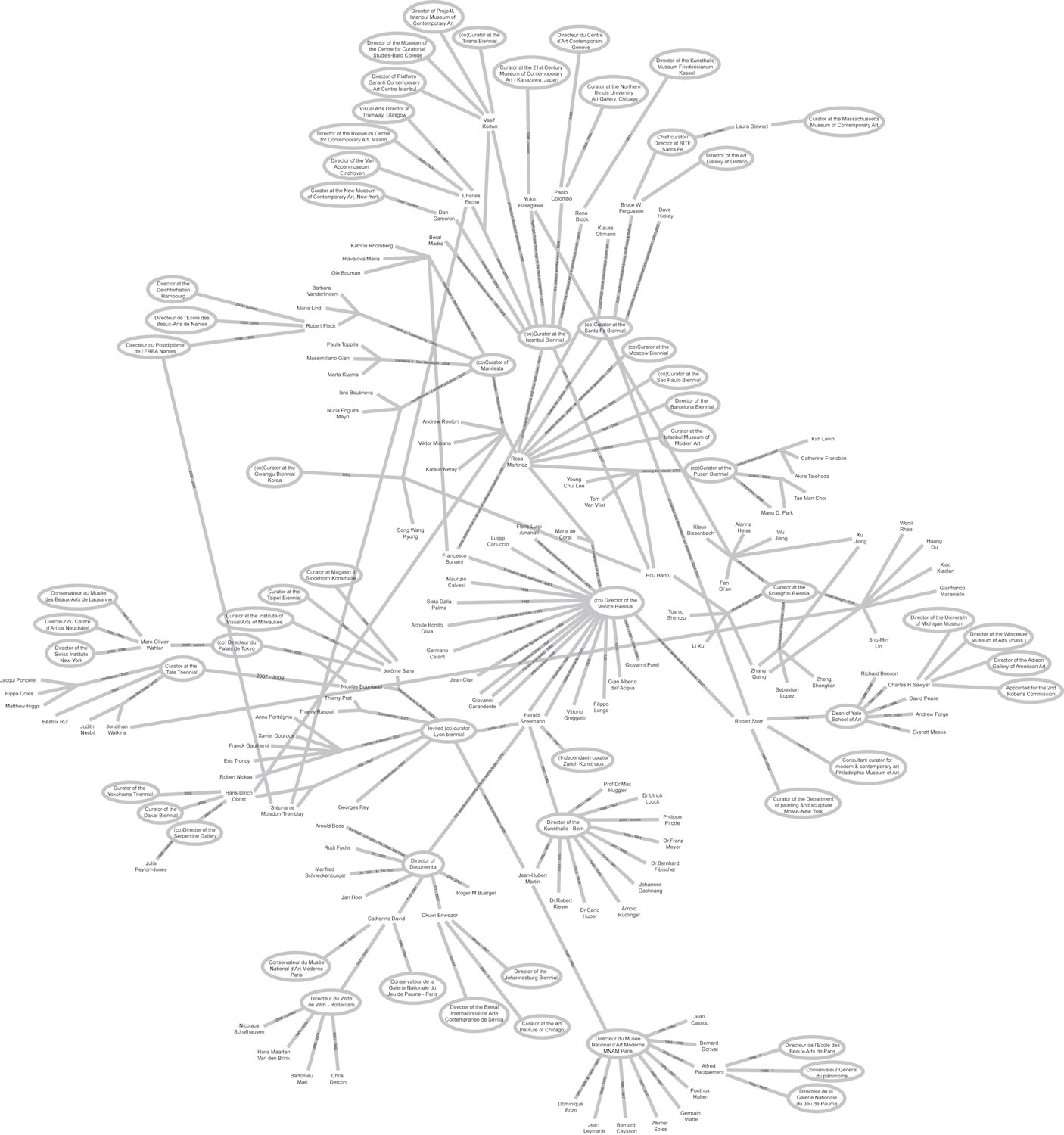
Plaques tournantes
Pencil on paper (or digital version for projection)
Evolutive dimensions
This work is a diagram, a map of the position of people in the art world. It emphasize the movements
and relations that rule the art microcosm. We can thus follow some people occupying an important
position in a museum and then changing places and leaving his former position to someone else who
himself was curator an anything else in another institution.
The point is not to moralize a system, but just to point out a network of interests.
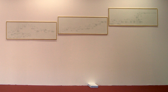
Ionesco Piece
Pencil on paper - Variable dimensions
This work is based on the famous novel by Eugene Ionesco, ‘The bald Soprano’.
I picked up an extract in which the fireman character tries to tell a story but gets lost in the description of
the relationships between the people he talks about. Then I mapped the ‘genealogical tree’ that could
be a good illustration of the absurd description of the fireman (who talks about a siter who had a father
whose doctor was the husband of the aunt of an engineer that married the cousin of.......)
My interpretation is subjective according to the double meaning of certain words. I made two versions of
the diagram, one in english and one in french.
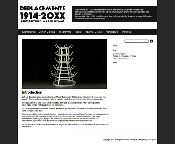
Déplacements 1914-20xx
Website (Present version in progress)
Various documents archive
This work is an investigation on an art object regarded as an icon in art history.The Internet is used as a
tool for collecting information, updating, and displaying media for those information once classified.In a
general approach centered on the notions of movements, networks, this works aims at revealing the geographic,
cultural, economic shifts of an object previously taken itself from its utilitarian function to rise to
the status of a work of art.
The distinctive multiplicity of this art object conveys a simultaneity of the work
in different places; in the same way , by using the internet to display the information, this simultaneity
changes to becomes informative.This web site is designed as an open structure, depending to evolve on
the participation of the net surfers.
Practically in space, this work is shown as an investigation office; all
the steps of the enquiry, notes, classifications, deductions, mistakes are clearly shown as constituent of a
method, a work in progress of which the most advanced form is the website.The physical movements of
the work of art make the virtual movements of the netsurfers.
It is up to anyone to travel in the history and geography of a work of art.
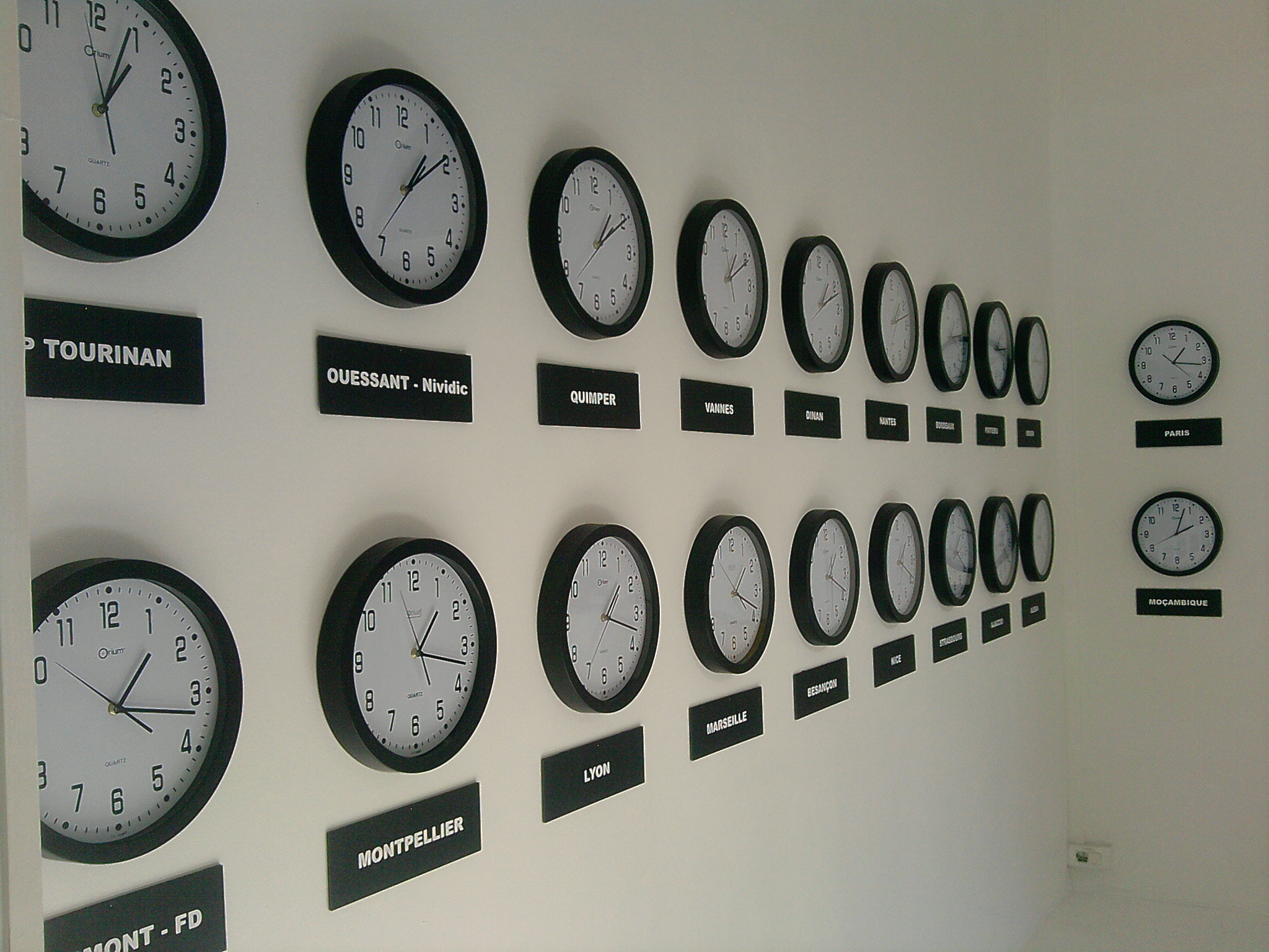
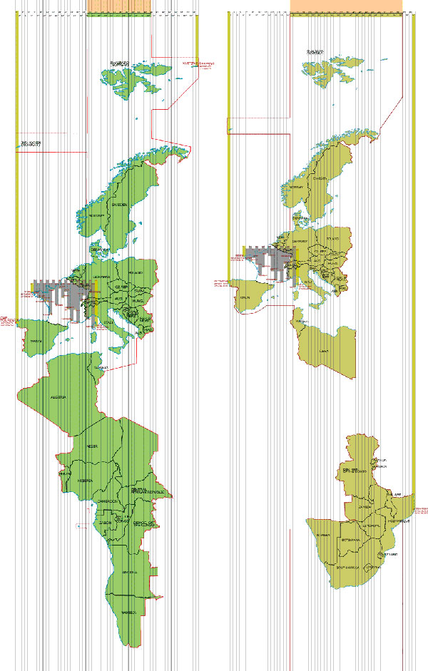
UTC +1
Digital prints: 270x70 cm (summer) / 270x80 cm (winter)
20 to 24 clocks according to the season
UTC+1 has two phases according to the change of time in winter and summer. It consists of a re-cutting
of a time-zone (UTC+1) in minutes. The piece is composed of a series of synchronised clocks, for each
minute-time-zone, + a map corresponding to the territories and countries included in the zone.
Of course, the winter time-zone is differentt from the summer time-zone, as not all the countries change
their time according to the season. There are then two maps, and the width of the zone varies, and thus
the number of clocks avries as well. This piece gives birth to 18 different time zones in France in summer,
and 22 time zones in winter. Clocks are all synchonised with one minute delay from the previous time
zone. When the fartherer point in the east of france is at 12.00, the fartherer point in the west is 12.18
(or 22 in winter)
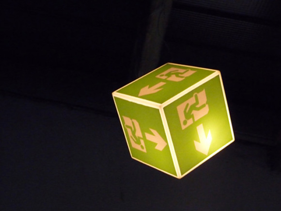
Out out
Vinyl prints on luminescent PVC cube
50x50x50cm
Out out is a multi-facetted luminous exit sign spinning on a rotative axis. It is meant to disturb the orientation of the visitor of the exhibition. Although the object gives a fictitious disorientation, it emphasize a halt, a questionning in case of emergency exit. It is a kind of mockery towards the multiplication of signs in our environment, that leads to a certain absurdity.
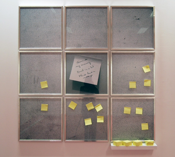
Halfalogue
9 framed photographies, woodstand, post-it blocks, pencil
160x160 cm
Quite unusually, Halfalogue is a personnal introspection into my life, that follows some genealogical
research that I made quite unsuccesfully. The little note photographied gives an indication of an absence
and states ‘Gone back to my memory, back in a bit, please leave a message’.
Quite unvoluntarily, Halfalogue is as much an unsaid reflexion about time passing, than an attempt to
join together past and present.
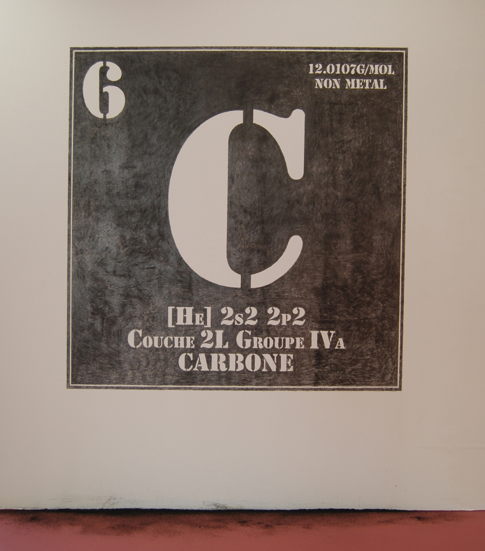
Carbone
Graphite, varying dimensions.
C = carbon, a non metalic element, exists under two forms at pure state: graphite and diamond.
For this piece the point is to use carbon under the form of graphite (a classical tool for drawing), to write
its chemical formula taken from the Mendeleiev classification.
The weight of the graphite used will determine the value of the piece according to the value of exchange
of diamond (another form of carbon), that is 0,2g=1 carat.
The piece is ephemeral, its dimensions are to be adapted to the place, and its value will depend on the
configuration of the place where it is made (size and quality of the wall).
It is a reflection about the materials of art, and the value of exchange of a raw material becoming valuable
as art.
Noble/ignoble - eternal/ephemeral - valuable/unvaluable:
two states of one molecule (carbon), one of which is the prerogative of the artist.
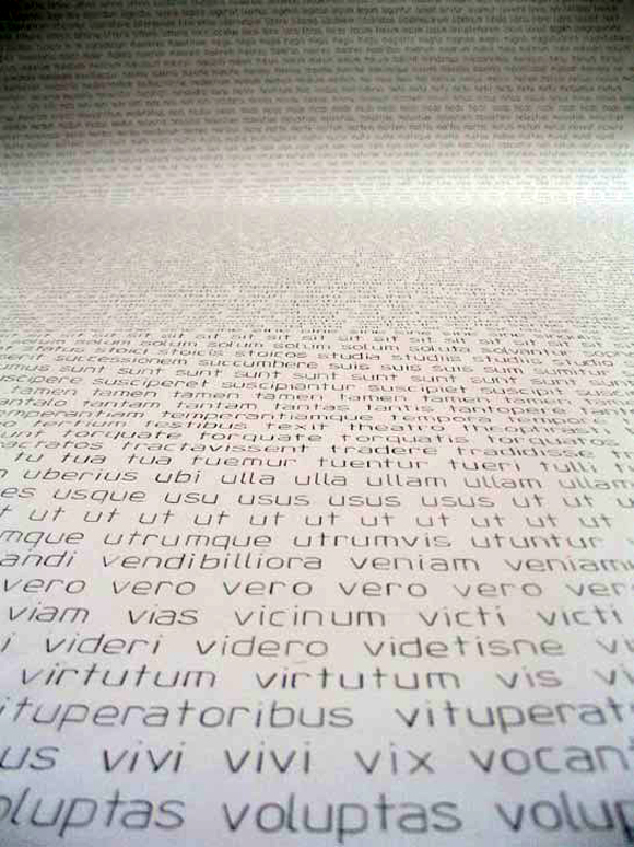
Ipsum Lorem
Pencil on paper L150xH350cm
Rayed Book
"De Finibus Bonorum et Malorum (Liber Primus, 32), Cicéron"
In publishing and graphic design, lorem ipsum is a standard placeholder text used to demonstrate the
graphic elements of a document or visual presentation, such as font, typography, and layout. Lorem
ipsum also serves as placeholder text in mock-ups of visual design projects before the actual words are
inserted into the finished product.
The text is derived from Cicero’s De finibus bonorum et malorum (On the Ends of Goods and Evils). The
original passage began: Neque porro quisquam est qui dolorem ipsum quia dolor sit amet, consectetur,
adipisci velit.This work is a re-reading of Cicero’s text, going back to the raw material that constitutes the
book and makes sense: the words.
I classsify all the words in alphabetical order, without any visual presentation.
From the Lorem Ipsum used as a Graphic tool, I go back to the original text (Cicero’s), and from this
text, I go back to the root of written language.
The result is an amount of words available, without any sense but with their potential. It is a non functional
text, without form but that holds in itself all the constituents of a tool that will be used as a placeholder
for any other text.
Each chapter is re-classified on a long sheet of paper, hand written.No form, no sense any more for a
commonly used text.
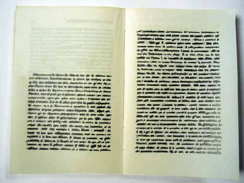
Untitled
Ink on blank newspaper
700x280 cm
(destroyed work)
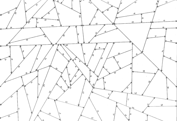
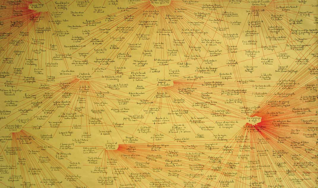
Graph on literary hypertext links, made with ink on paper.The catalogue of the GNS exhibition (Palais de
Tokyo, Paris 2002) was an important reference in the genesis of my work at that time. This book is the
starting point of the whole graph. From this reference, I made a survey of the footnotes and bibliographies
stating the references of this book.The operation was repeated for each new reference, each new
book when I had access to it.
Links are drawn from one title to another, and as far as possible,a title is only mentioned once even
though it is linked to several referents; the links are then repeated.
A book is not a closed space, it is linked with other books and thus develops its own cultural landscape.
In this work, hypertext links are emphasized, it shows the references that fed a book that fed another and
so on and so forth, in an potentially infinite network.
It is a matter of cultural landscape, and the result conveys the idea of landscape; we find ourselves in
front of a map, meaning contemplation, browsing in a reading process to find a path from a reference
to another and get lost.
The profusion of references that lead to one single book (the starting point, GNS exhibition catalogue),
is such that one can lose his way, and take other unexpected paths.
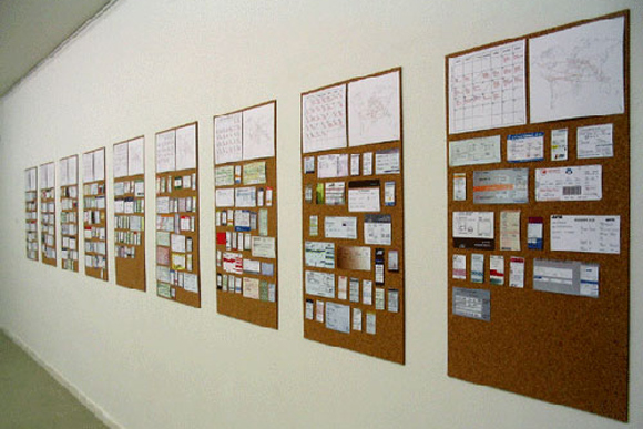
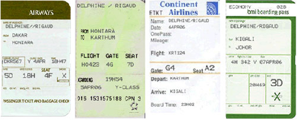
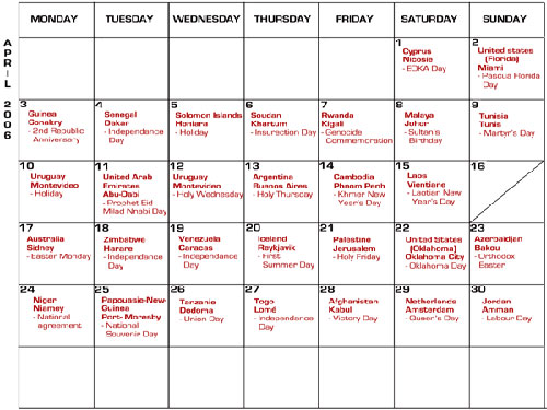
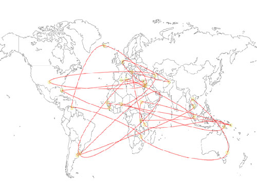
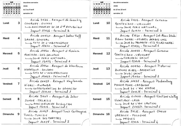
Full-time
Annual Calendar listing all the holidays day after day, throughout the world, giving the motive of celebration.
365 boarding passes at my name, to go from place to place.
Maps of all the potential routes
This work consists first in establishing a calendar of public holidays throughout the world for a whole year.
From this calendar, I plan a travel route so to be each day in a place where the day is a public holiday. It means to book flights to travel from a country to another, on constant situation of transit, from an airport to another; no more pleasure-trip but displacements in the never ending places of work that are airports.
I intend to stress what keeps on working while a whole country should not to work by government decree for reasons of commemorations, religion or else. The never ending pursuit of free time becomes even more constraining than work itself, and implies here a desperate race against time, against geography and the History of each country that sets its holidays.It is a quest of idleness in places where work never stops.
The point is also to think about the status of some airports (international ones), which wherever they may be located are kinds of "non site", with specific status for they don't belong to any particular nation.
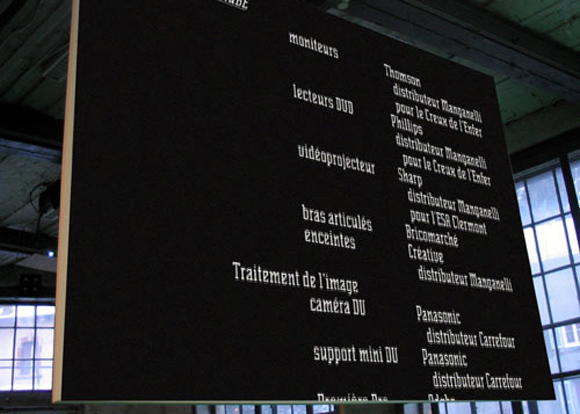
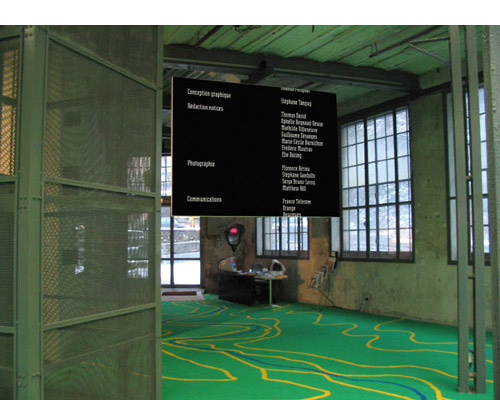
Génériques (Credits)
Video installation - Project for Les Enfants du Sabbat 7, THIERS
This work is composed of two screens put, one at the entrance and the other at the exit of a collective exhibition.
Each screen broadcasts credits that could be seen in a movie (as seen in cinema), listing the names of all the
people involved in the exhibition, but also everything that is constitutive of the exhibition but that is not supposed
to be divulged as part of it.
Thus, on top of the artists’ names and works and of the curators, the whole backstage participation is mentioned,
including trainees, technical support, material retailers, transporters, material rental, sponsors etc...
Regarding the general tendancy to scripted exhibitions, I intend to show the backside of the scenery, or more particularly
in my proceeding, the hidden part of the iceberg.
The visitor is introduced to the exhibition with the first screen displaying the first credits made of brief information
about what he is about to experience; after the exhibition and before he leaves, he will have to view the second
credits, more comprehensive showing the unseen, everything more or less related to what he has been experiencing.
Once again, the point is to reveal things before our eyes, to emphasize anything that led to a final result.
Names and words becoming my raw material.
The soundtrack is based on the title of the exhibition, actually written with the Senator typography on a music
software, and read by the program as keys on a piano; the program operates a sort of musical scanning on the
title, beyond any decision of composition on my part.
watch the videos
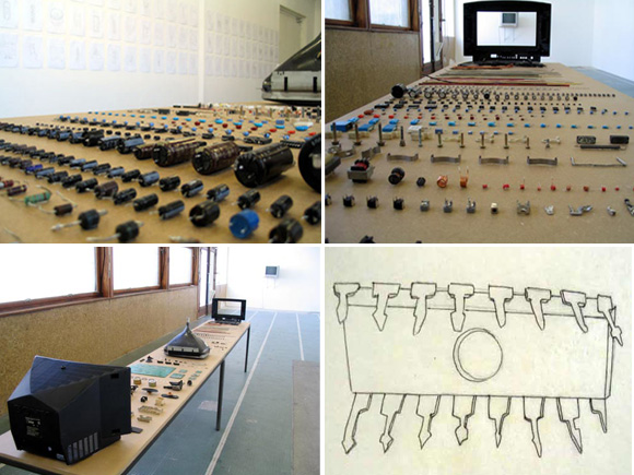
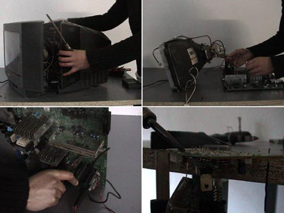
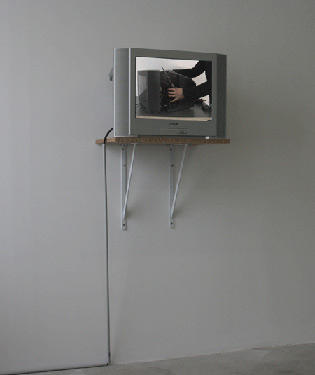
Reality TV
TV-set electronic components on table (wood/metal) 400 X 60 cm
99 drawings 21 X 29,7cm each ; ink on paper
Looped video, 2h15’
I got interested in an object made in assembly lines and that we oftenly see in almost any art show: the TV-set,
a trivial object, daily used but of which we only watch the surface. When I go to an art show, and am to watch
videos on TV-sets, I am meant to visualize the image produced by the artist and played on the TV, and thus, I only
watch one surface of a complex object , three dimensional, produced by technology implying specific skills of
fabrication.
This object is produced on automated assembly lines where human intervention is almost inexistant.
Then I set myself in dissassebling a TV-set one element after another, without any indication about how to proceed.
What is at stake is showing the fastidious process of dissassembling by hand an object made by machines. By
dissassembling the TV-set, I trace back to a former physical state of the object, but I also trace back to a state of
labour previous to our times.
Labour is then presented as a fact: here is what a TV-set is, here is the sum of work it means.
- A video shows the whole process of dissassemblage, long and tedious.
- Facing the video is a long table presenting all the elements extracted and classified in an arbitrary way by
someone who obviously doesn’t know the us of each element, and classifies things following other rules such as
color, shape or size.
- A series of drawings echoes the elements, each one of those are drawn in simple lines. Those working-drawings
are as part of production specifications listing all the «ingredients» to use to make a TV-set.
Un juste retour des choses
Installation action.
108 bottles edited for the occasion, each containing a message.
108 glass elements (20x20cm) constituting a drawing (400x160cm)
This project is about the production cycles of the material used for the making of the piece.
From a common object such as a bottle, the point is to take into account the action of recycling that will lead to the obtaining of the material that consitutes the final piece.
During the opening and for the duration of the show, people will be invited to buy bottles (in limited edition), each containing a message asking them to recycle the bottle.
In the same time, a large fragmented drawing on glass is presented, drawn on as many fragments as the number of bottles available. The weight of a glass fragment is equivalent to the weight of a bottle.
The buyer, if he recycles his bottle, and proves it, will acquire one fragment, one piece of glass with an abstract drawing on it.
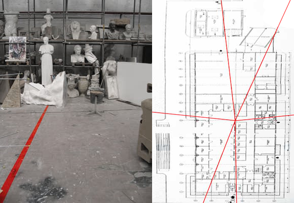
142 avenue Jean Mermoz
Drawings on paper
Floor painting, scale 1:1
From the address of the Art School of Clermont Ferrand (142 avenue Jean Mermoz), I made a survey of the similar addresses in other cities (Lyon, Perpignan, Cergy-Pontoise, Lille...)
From the central point of the site of the Art school in Clermont Ferrand, I drew lines on the ground in the direction of each location of the addresses 142, avenue Jean Mermoz.
Each line painted on the ground crossed the walls, and extended to the outside but stopped at the limits of the site.
Our urban spaces are fragmented into indexed and named blocks. Physical space is conventionnally associated with a name, a number. From a city to another, names and thus addresses are the same; from then, an index of similar addresses could be set.
In this work, I intended to make a link between locations similarly named; to which place the address 142, avenue Jean Mermoz leads me.
An imaginary line is painted on the ground, a direction to follow relentlessly, and which at a certain point will make me find the similar address, yet somewhere else.
It is an invitation to travel, projected somewhere in a straight line direction, according to travels by plane (J.Mermoz was an aviator).
From the 142, avenue Jean Mermoz in Clermont-Ferrand, I tried to lead to the 142, avenue Jean Mermoz in other places, tracing paths and not routes, a mere convention becoming a radiation.
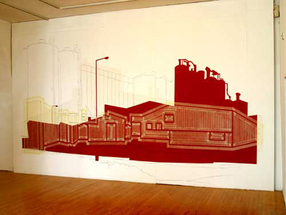
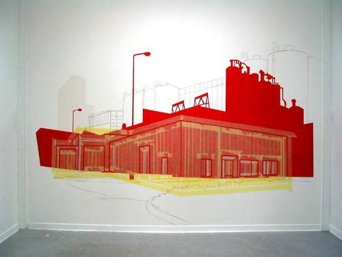
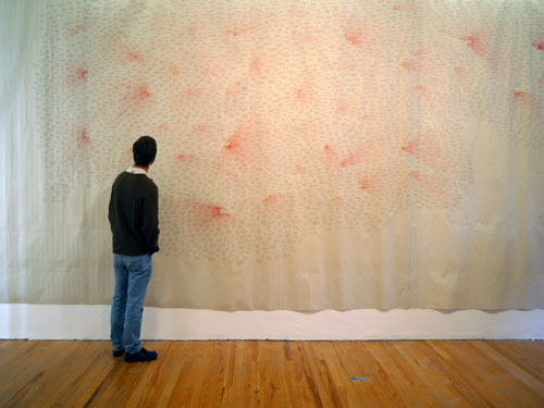
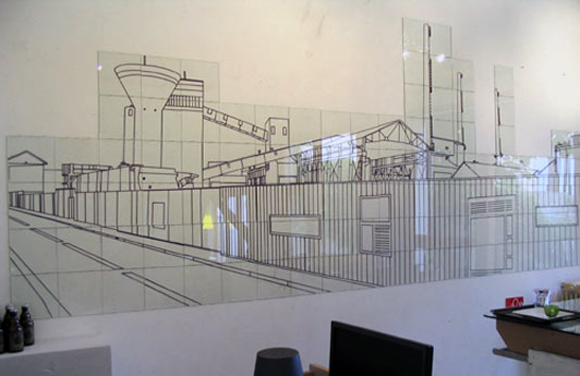
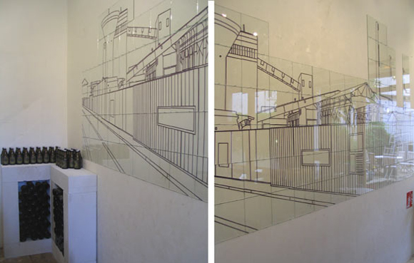
Made in...
Plaster, graphit, masking tape, acrylic paint
Variable dimensions
Wall painting made of four layers (plaster, graphite, masking tape, acrylic paint)
Each layer represents an image of the place where the material used was produced (Factory)
Each image is autonomous but because of the superimposition, each image interacts with the three other images.
The material qualities of each layer are altered by the superimposition or not on the other layers.
The purpose of this work is to deal with the provenance of the materials constituent of a wall painting.
The process of superimposition of images related to the production factory for each material allowed me to deal with the origin of things without using the map.
By the means of painting and image, I show a geographic reality of the materials gathered on the very place I carry out this work.
Tracing back in this work only concerns the production site of the finished material.